
Introduction
According to the 2024 UK Office for Statistics Regulation Tracker Survey, 65% of people reported that news stories portray the use of data negatively. That is a massive jump. Frankly, I don't blame them.
Over my decade of teaching university-level statistics, I have watched countless students struggle to trust the numbers they read. I hear the same frustration constantly in my office hours and on Reddit forums like r/statistics. One student perfectly captured this exact issue: "How do you even trust the news anymore? Every graph they show on TV seems to start the Y-axis at some random number to make the difference look huge."
I'll be honest. Separating good data from bad data is harder than it looks. Even seasoned researchers get it wrong. But by the end of this guide, you will have a veteran's toolkit to spot manipulated data instantly. You will know exactly what to look for, whether you are scrolling through a viral post or reading a peer-reviewed journal.
Conventional wisdom says manipulation is mostly done by malicious politicians. But actually, well-meaning researchers and students accidentally manipulate data all the time due to academic pressure and poor statistical literacy. Here is how it happens.
What Are Misleading Statistics?
Misleading statistics involve the misuse of numerical data to intentionally or unintentionally distort reality. This happens when analysts cherry-pick data, use the wrong averages, manipulate graph axes, or p-hack their results to force a false narrative.
The term "statistics" originally referred to data collected by the state in the 18th century for taxation and military planning. Back then, data collection was mostly about establishing objective facts for governments. Today, statistics have morphed into a highly sophisticated tool for persuasion in business, politics, and media.
A 2024 study by the National Statistician's Office found that public trust in raw numbers remains high, but trust in how the media and politicians use those numbers is declining rapidly. We live in an era where data drives everything from global healthcare policy to local business decisions. If you can't spot statistical manipulation, you are completely vulnerable to misinformation.
Most textbooks stop at the basic math. But the reality is much messier. A common pitfall is assuming that if data comes from an official source, it can't be misleading. The raw data might be perfectly accurate. The framing is where the manipulation happens. For example, reporting a 300% increase in a rare disease sounds terrifying until you realize the baseline moved from 1 case to 4 cases in a city of millions. The problem with statistics is not the math itself, but the human interpretation and application of it, as Darrell Huff famously pointed out.
In my office hours, I see about three students per week confused by this exact issue. They bring in a beautifully formatted chart from a major news outlet and assume it is gospel truth. I have to show them how the data was sliced to hide the actual context.
The History of Data Manipulation
People have been torturing data for centuries. Long before modern statistical software existed, data was manipulated to fit specific agendas. In 1954, Darrell Huff published How to Lie with Statistics, a book that laid out the blueprint for visual and numerical deception. Before that, in 1948, the famous Kinsey Reports on human sexuality faced massive backlash. Critics pointed out severe sampling bias because the researchers relied heavily on convenience samples like college students and prison inmates. The math was right, but the foundation was flawed.

By the 1970s, entire industries realized the power of statistical ambiguity. The tobacco industry notoriously weaponized the confusion between correlation and causation to delay public health policy for decades. They didn't have to prove smoking was safe. They just had to manipulate the statistics enough to create doubt in the public mind.
Today, the pressure has largely shifted to academia and media. The modern "publish or perish" culture forces researchers to find statistically significant results to keep their jobs. This leads to a massive crisis of manipulated data. A landmark 2015 study published by the Open Science Collaboration found that more than half of published psychology studies failed to replicate. We have moved from malicious corporate manipulation to desperate academic survival.
Why does this matter for your coursework? You are entering a workforce where data literacy is mandatory. According to the National Center for Education Statistics (NCES) in 2023, only 22% of high school graduates are considered proficient in data literacy. When you understand the history of how data gets twisted, you learn to ask better questions.
Take the 2022 Southwest Airlines meltdown. When their scheduling software crashed, executives were looking at flawed data dashboards that hid the severity of the crisis. Nearly 70% of executives say they have made a significant business decision based on flawed or misleading data, according to a 2023 Gartner Data Quality Report. If you know how to interrogate a dataset, you will have a massive advantage over your peers.
How Can Statistics Be Manipulated? 5 Common Techniques
If there is one thing I have learned from a decade of grading student research papers, it is this: data doesn't lie, but analysts do. Sometimes it is malicious, but most of the time, it is just sloppy methodology. Here are the five most common ways statistics are manipulated.
1. P-Hacking and Data Dredging
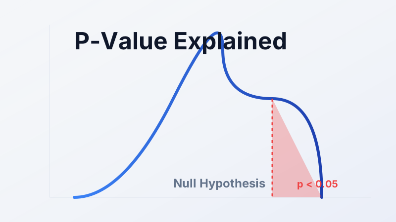
The concept: P-hacking occurs when researchers run exhaustive analyses on a dataset, testing hundreds of variables until they find a relationship that crosses the arbitrary threshold of statistical significance (usually a p-value of less than 0.05). They then report this "discovery" as if they had hypothesized it from the start.
The deeper truth: In my experience, students do this accidentally all the time. They run 20 different ANOVA tests on a dataset and only put the one significant result in their final paper. But the math dictates that if you run 20 random tests using a 95% confidence interval, at least one will show a false positive purely by chance. This is the part most guides skip: p-hacking isn't always a malicious act. Often, it is a byproduct of a researcher desperately looking for a pattern where none exists.
Real-world example: While business A/B testing seems prone to this, a 2024 ResearchGate study of 2,300 corporate A/B tests found minimal p-hacking in industry because bad data costs real money. In academia, however, the incentive to publish is overwhelming. A recent analysis found a suspicious "bunching" of p-values exactly at 0.049 in major academic journals.
2. The "Average" Trap (Mean vs. Median)
The concept: When someone says "the average," they usually mean the mean (adding all numbers and dividing by the total). But the mean is heavily skewed by outliers.
Real-world example: Consider US household income data from the United States Census Bureau (census.gov). If you put nine working-class people in a room with Elon Musk, the "average" (mean) net worth of that room is suddenly tens of billions of dollars. But the median (the exact middle value) remains working-class. Politicians love using the mean to brag about economic growth while hiding inequality.
| Metric | What It Is | Best For | Limitations |
|---|---|---|---|
| Mean | The arithmetic average of all values. | Normally distributed data without extreme outliers. | Highly sensitive to extreme highs or lows. |
| Median | The exact middle point of a dataset. | Skewed data like income, home prices, or test scores. | Ignores the actual values of the extremes. |
| Mode | The most frequently occurring value. | Categorical data (e.g., most common shoe size). | Not useful for continuous numerical data. |
3. Visual Manipulation (Y-Axis Shenanigans)
The concept: You can completely change the narrative of a dataset without altering a single number, simply by zooming in on the graph.
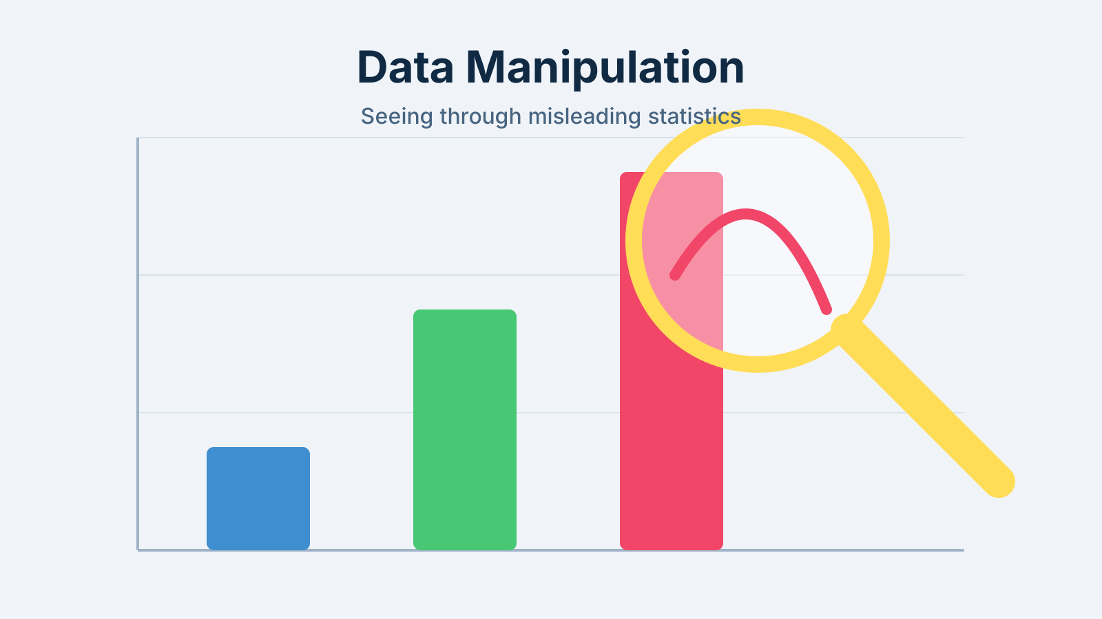
The deeper truth: Truncating the Y-axis (starting it at 50 instead of 0) makes a tiny 1% variance look like a massive, volatile spike. I see this constantly in political campaigns and corporate earnings reports.
Real-world example: Look at almost any modern political campaign. A candidate might show a bar chart of unemployment dropping. But if you look closely at the Y-axis, it doesn't start at zero. It starts at 4.5% and ends at 5%. A drop of 0.5% looks like a massive cliff on the graph, visually tricking the reader into thinking unemployment was cut in half.

4. Cherry-Picking Data
The concept: This involves selectively presenting only the data that supports your argument while hiding contradictory evidence.
The deeper truth: You see this everywhere in product marketing. A skincare brand might test their cream on 50 people, but only 10 see results. They then survey only those 10 people and advertise "100% of surveyed users saw improvement!" The claim is technically true based on the filtered dataset, but it is entirely misleading to the consumer.
Real-world example: It happens even in hard sciences. A 2023 study published in the Journal of Periodontal Research and indexed on the National Institutes of Health (nih.gov) found that nearly 50% of the examined clinical trials exhibited selective outcome reporting. Researchers only highlighted the outcomes with positive results and conveniently omitted the rest.
5. Correlation vs. Causation
The concept: Just because two trends move together does not mean one caused the other.
Real-world example: Ice cream sales and shark attacks both spike in July. Does eating ice cream cause shark attacks? No. The confounding variable is summer weather. While this sounds obvious, similar logical leaps are published daily in health and nutrition journalism.
Why Do People Manipulate Statistics? (Academic Pressure & Bias)
It is easy to assume that data manipulation is a dark art practiced by evil masterminds. Frankly, most textbooks frame it that way. But the reality is much more mundane. Most statistical manipulation is born from pressure and cognitive bias.
I'll be honest. When I first started reviewing research papers, I assumed every error was a deliberate attempt to deceive. What I quickly learned is that cognitive bias plays a massive role. Researchers often suffer from confirmation bias. They have a hypothesis they deeply believe in, and they subconsciously shape their data cleaning processes to favor that outcome. They might exclude an "outlier" that contradicts their theory, convincing themselves it was just a measurement error.
In academia, the driving force is the "Publish or Perish" culture. University professors and graduate students depend on publishing original, significant research to secure tenure and grant funding from institutions like the National Science Foundation (nsf.gov). A null result finding that a new teaching method does not improve test scores is incredibly hard to publish. Journals want breakthroughs. This structural incentive pushes well-meaning researchers into p-hacking and cherry-picking just to survive.
In the corporate world, the pressure is tied to quarterly earnings and performance reviews. A 2023 Gartner survey found that nearly 70% of executives admitted to making significant business decisions based on flawed data, often because middle managers massage the metrics to hit KPIs. The data isn't fake. It is just stretched until it looks good. If a marketing team's bonus depends on showing a 10% increase in engagement, you can bet they will find a statistical method that delivers exactly 10.1%.
How to Identify Manipulated Statistics (The 3-Question Test)
You do not need a PhD to spot bad math. You just need to ask the right questions. Over the years, I have developed a simple 3-question framework that I force all my undergraduate students to use when evaluating a source.
| The Question | What It Uncovers | Example Scenario |
|---|---|---|
| 1. Compared to what? | Missing baselines and relative vs. absolute risk. | "Crime is up 200%!" (But it only went from 1 incident to 3 in a huge city). |
| 2. Since when? | Cherry-picked timelines. | A stock portfolio looks amazing if you only show data from the day after a market crash. |
| 3. Says who? | Funding bias and conflicts of interest. | A study showing the health benefits of sugar, funded by a soda company. |
When you apply this framework to your own research papers, you instantly elevate the quality of your work. Educational resources from institutions like Stanford University (stanford.edu) emphasize that critical thinking in statistics is far more valuable than computational ability.
Applying this level of scrutiny to every article you read is exhausting. You don't have to do it for every trivial news piece. But when you are making a major financial decision, voting, or writing a final paper that determines your grade, this 3-question test is your best defense against manipulation.
How to Succeed: Practical Application
Now that you understand how easily statistics can be manipulated, here is how to actually apply this knowledge to pass your class and write airtight research papers.
Try the "Pre-Registration Method" for your own essays. Before looking at your dataset, write down your hypothesis and the exact statistical test you plan to use. This prevents accidental p-hacking. Additionally, use the "Feynman Technique" for statistical concepts: explain what a p-value is in plain English to a friend who isn't taking the class. If you rely on jargon, you don't actually understand the concept.
When writing a statistics paper, always explicitly state your sample size limitations and how you handled missing data. Your professor knows your data isn't perfect. We are grading your transparency, not just your math ability.
Don't run twenty different models hoping one works. Spend 80% of your time cleaning your data and defining your variables, and only 20% running the actual analysis.
Common Mistakes to Avoid
Why do students fail statistics papers? Because they focus on getting a "significant" result rather than an accurate one. Here are the biggest errors I see every semester.
The "Kitchen Sink" Approach
What students do wrong: Running every possible test on a dataset until something sticks.
Why it happens: Desperation to find a significant p-value before a deadline.
How to avoid it: Stick to the primary outcome you planned to test. If the result is null, report the null result. A well-written paper analyzing a null result will always score higher than a poorly justified p-hack.
The N=1 Fallacy (Inadequate Sample Size)
What students do wrong: Drawing massive, sweeping conclusions from a tiny sample size.
Why it happens: Students survey 15 of their classmates and assume this perfectly represents the entire university population.
How to avoid it: Acknowledge the limits of convenience sampling. Write "This trend was observed in a small sample and requires further study" instead of "This proves X causes Y."
Ignoring Model Assumptions
What students do wrong: Applying tests like an ANOVA without checking if the data is normally distributed.
Why it happens: Plugging numbers into SPSS or R without understanding the underlying mathematical assumptions.
How to avoid it: Always run your diagnostic plots before running your main analysis.
The common thread among all these mistakes is prioritizing the final number over the integrity of the process.
Essential Resources
If you need to strengthen your foundational knowledge, here are some verified resources that actually help.
Free Resources:
- OpenStax Statistics (openstax.org): A completely free, peer-reviewed textbook used in many universities.
- Crash Course Statistics: Excellent YouTube series for visual learners struggling with abstract mathematical concepts.
- The United States Census Bureau Data Tools (census.gov): An incredible repository of raw, unmanipulated datasets that you can use to practice your analysis skills.
Professional Resources:
- American Statistical Association (amstat.org): Offers great student resources and strict ethical guidelines for data analysis.
- Office for Statistics Regulation (osr.statisticsauthority.gov.uk): Provides fantastic real-world case studies on public data misuse.
Our Services:
Still feeling lost? You don't have to figure it out alone. Our expert statistics tutors can help you clean your data, choose the right tests, and ensure your final paper is statistically sound without the stress.
Conclusion
You started this article wondering why 65% of people distrust statistics in the news. Now you know exactly how those numbers are manipulated, from truncated Y-axes to the quiet desperation of p-hacking. Understanding manipulation techniques is crucial for data literacy, but if the mathematical rigor is too demanding, academic platforms exist where you can pay an expert to take my statistics class for me and secure your grades.
Here is what you need to remember:
- The mean is easily skewed by outliers; the median tells the true story.
- Correlation does not equal causation, no matter how convincing the graph looks.
- Always ask: Compared to what? Since when? Says who?
- A transparent null result is vastly superior to a manipulated significant result.

You've got this. Data literacy is one of the most lucrative skills you can build. The U.S. Bureau of Labor Statistics projects a 34% growth in data science roles between 2024 and 2034. Master these concepts, and you will be indispensable in your future career.
Here is your next step: Tonight, pull up a news article with a shocking statistic and apply the 3-Question Test. See if the data actually holds up under scrutiny.
If you need a hand analyzing your own dataset, reach out to our statistics experts today.