
Introduction: The Calculation vs. Application Crisis
At 2:00 AM before my first undergraduate statistics midterm, I was hunched over a desk trying to cram every formula from six chapters onto a single index card. I used a 0.3mm ultra-fine pen, writing in a font so small it looked like ancient runes. I thought if I could just write down every variation of the sample variance, the central limit theorem, and the probability union rules, I would pass. The next morning, when the test paper landed on my desk, panic set in. I could not find the formula I needed in the wall of microscopic ink, and the symbols blurred together. I ended up guessing between a z-test and a t-test, and got a miserable D. That card did not save me, it actually made me fail.
And my experience is far from unique. Research by Cassady and Johnson in 2002 established that between 25% and 40% of college undergraduates experience moderate to high levels of statistics anxiety. This anxiety does not just make your palms sweat, it directly blocks working memory during exams, making it incredibly difficult to recall formulas.
But there is a proven way to bypass this mental block. A 2012 study by Michael de Raadt at the University of Southern Queensland showed that students who were permitted to use a cheat sheet during a statistics exam achieved a mean score of 32.5 out of 50. Contrast that with the group taking the closed-book exam, who averaged just 23.9 out of 50. That is a massive 36% increase in scores.
But here is the catch: the sheet is not a magic cheat code. Having the formulas written down is useless if you do not know when to use them. In my ten years of grading exams, I have seen hundreds of cheat sheets. The ones that work are not the ones with the most equations. The winning sheets are designed like a logical search engine.
I have watched students spend hours writing out long algebraic derivations. But during my office hours, when I ask them to identify the independent variable in a simple test problem, they draw a blank. That is the calculation vs. application crisis. Standard textbooks train you to compute, but exams test your ability to select. We need to bridge that gap. This guide will show you how to structure yours so you can walk into your exam room and secure your grade without the panic.
Active Synthesis: Why the Process of Making a Cheat Sheet is the Real Study Guide
Many students ask if they can just download a PDF of a cheat sheet from a website or borrow one from a classmate who got an A last semester. My answer is always a firm no. It sounds like a shortcut, but it is actually a recipe for failure. If you use someone else's sheet, your brain lacks the spatial memory of where each formula is located. During a timed test, every second counts. If you spend three minutes searching a cluttered paper for the binomial distribution equation, you run out of time for the calculation itself.
The true value of a cheat sheet is not the final piece of paper. It is the cognitive process of choosing what goes on it.
The American Statistical Association (ASA) highlighted this in a pedagogical review, stating that the creation of a cheat sheet is a metacognitive exercise. It forces you to evaluate what you know, categorize information, and prioritize critical relationships over rote memorization. It transforms passive reading into active structural learning. When you sit down and decide that a z-score formula is more important than a long algebraic proof, you are actively studying.
This is backed up by scientific research. A 2012 controlled academic trial by Gharib, Phillips, and Mathew at Pepperdine University demonstrated that allowing students to use a self-prepared crib sheet significantly reduced state test anxiety scores. More importantly, it maintained identical long-term retention levels on a surprise retest two weeks later. The students learned just as much because they had to actively synthesize the material to make the sheet.
To make this work, follow three simple layout rules:
- Categorize by statistical task instead of chapters. Do not write formulas in chronological order. Group them by descriptive statistics, probability, estimation, and hypothesis testing.
- Omit algebraic proofs. You do not need to show how to derive a formula. Write only the inputs, the formula itself, and what the output represents.
- Handwrite your sheet if possible. Handwriting builds motor-memory links that typing cannot replicate.
When I was teaching introductory statistics at UCLA, I noticed a clear trend. The students who printed out a digital cheat sheet from a Google Drive folder and did not look at it until exam morning spent half their testing time squinting at the paper in confusion. But the students who spent the weekend before the exam arguing about which version of the standard error formula to include, and hand-writing it on their sheets, finished the exam early. The act of creation is the actual preparation. By the time you finish writing, you will find you barely need to look at the sheet anyway.
The Notation Translator: Demystifying Sample Statistics vs. Population Parameters
One of the most common reasons students lose points on statistics exams is notation confusion. I see this error weekly during office hours. A student understands the logic of a hypothesis test, but they substitute the sample standard deviation into a formula that requires the population standard deviation. Or they write mu instead of x-bar in their null hypothesis statement, leading to an immediate deduction.
To solve this, your cheat sheet needs a dedicated Notation Translator. The easiest way to remember this distinction is a simple rule: sample statistics use Latin letters, while population parameters use Greek letters.
Let's look at the standard pairs you must keep straight:
- First, the mean. The sample mean is represented by x-bar, while the population mean is represented by the Greek letter mu.
- Second, the standard deviation. The sample standard deviation is represented by the letter s, while the population standard deviation is represented by the Greek letter sigma.
- Third, the variance. The sample variance is represented by s squared, while the population variance is represented by sigma squared.
- Fourth, the proportion. The sample proportion is represented by p-hat, while the population proportion is represented by the letter p.
If you write these down in a clear, side-by-side table on your sheet, you will avoid mixing them up under exam pressure.
| Concept | Sample Statistic (Latin) | Population Parameter (Greek) |
|---|---|---|
| Mean | x̄ (x-bar) | μ (mu) |
| Standard Deviation | s | σ (sigma) |
| Variance | s² | σ² |
| Proportion | p̂ (p-hat) | p |
| Size | n | N |
But notation confusion goes deeper. Many students struggle with the difference between standard deviation and standard error. This is a common question on introductory exams.
Standard Deviation (SD) measures the variability of individual data points within a single sample. If you measure the height of 100 students at UCLA, the standard deviation tells you how much those heights spread out around the sample mean.
Standard Error (SE), however, measures the variability of sample means across multiple hypothetical samples. If you drew 50 different samples of 100 students and calculated the mean height for each group, those sample means would have their own dispersion. The standard error is the standard deviation of that sampling distribution. The mathematical formula is: Standard Error of the Mean = s divided by the square root of n. Where s is the sample standard deviation and n is the sample size. Note how standard error is always smaller than standard deviation, and it shrinks as your sample size increases. If your exam question asks you to calculate the interval for a sample mean, you must use the standard error, not the raw standard deviation.
Let's check this in action with a concrete example. Imagine you have a sample of 25 students with a standard deviation of 10. The standard deviation is 10, but the standard error is 10 divided by the square root of 25, which equals 2. Using 10 instead of 2 in your confidence interval formula will make your interval five times too wide, costing you full credit on the exam.
And this difference is not just semantic. In the real world, population parameters are almost always unknown. We cannot measure the height of every single student in the United States, so the true population mean (mu) is a mystery. We use the sample mean (x-bar) as our point estimate to make an educated guess about mu. This is the entire foundation of inferential statistics. Mixing up the symbols is not just a spelling mistake, it shows a fundamental misunderstanding of the relationship between sample and population. Write down this distinction clearly at the top of your cheat sheet so it is the first thing you see.
Descriptive Statistics Formula Directory: Center & Variability
Descriptive statistics form the bedrock of any formula sheet. They summarize the characteristics of your dataset before you run complex tests. But a major trap for college students is memorizing these formulas as isolated math equations without understanding how to compute them in software like Excel or R. Modern lab exams test both manual calculations and computer syntax, so your sheet must bridge this gap.
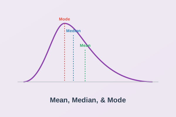
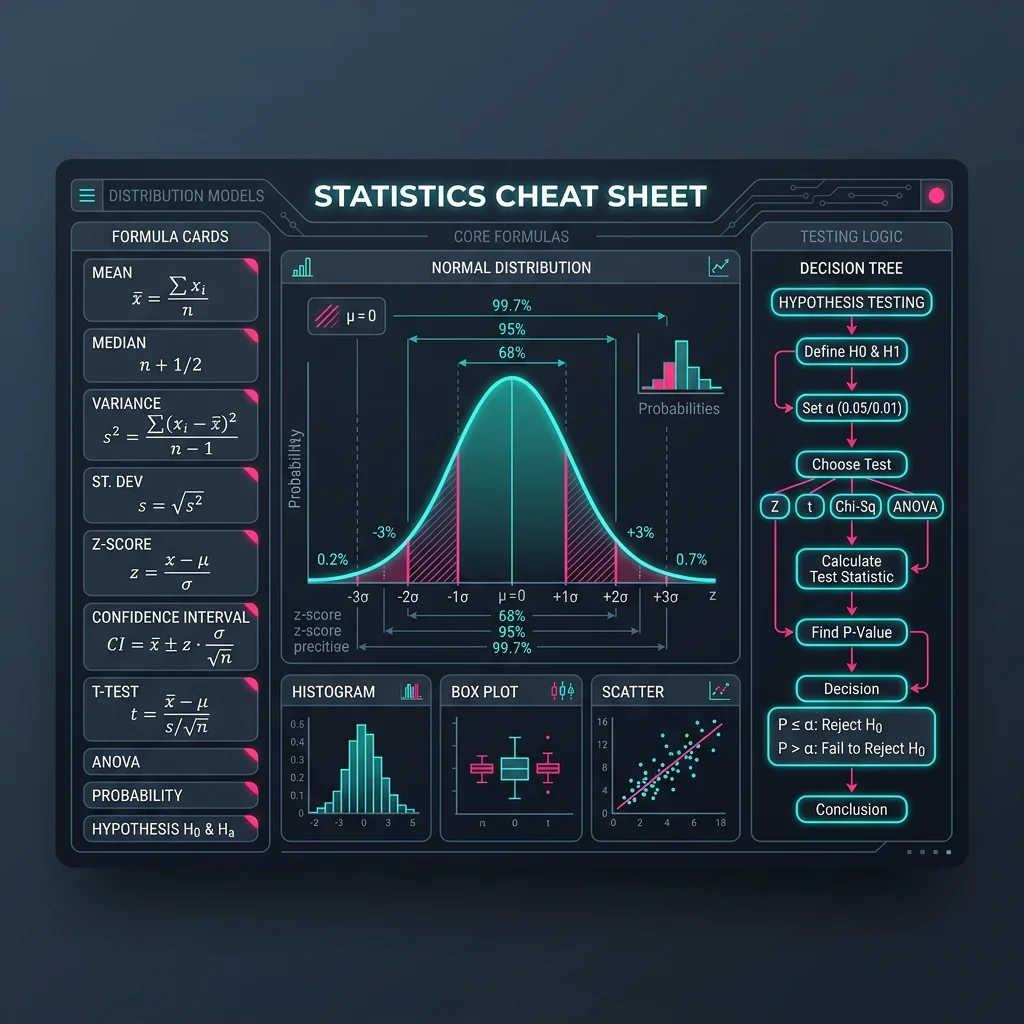
Let's define the formulas you will need. The arithmetic mean is the sum of all data points divided by the sample size, represented by x-bar equals sum of x-i divided by n. For the median, you must sort the dataset from least to greatest. If your sample size is odd, the median is the exact middle value. If your sample size is even, the median is the average of the two middle values. The mode is simply the most frequent value. The range is the difference between the maximum and minimum values.
But when we measure variability, the formulas get more complex. The sample variance is the sum of squared deviations from the mean divided by n minus 1. The formula is s squared equals sum of open parenthesis x-i minus x-bar close parenthesis squared, divided by open parenthesis n minus 1 close parenthesis. The sample standard deviation is the square root of the variance. We divide by n minus 1 instead of n to correct for bias, which is known as Bessel's correction. Writing this detail down will prevent you from making a standard calculation error on your test.
Let's look at the standard software commands for these calculations. In Excel or Google Sheets, the mean is calculated using average of range. The median is median of range. The mode is mode dot sngl of range. The sample variance is var dot s of range, and the sample standard deviation is stdev dot s of range. In R, these become mean of x, median of x, var of x, and sd of x. Having these written next to each other saves precious time during computer-based lab exams.
The most important tool for comparing different datasets is the z-score. A z-score measures how many standard deviations a data point is from the mean, enabling direct comparison of different datasets. The formula is z equals open parenthesis x minus mu close parenthesis divided by sigma for populations, or open parenthesis x minus x-bar close parenthesis divided by s for samples.
Let's see a concrete example of why standardizing is necessary. Imagine John scored 30 on the ACT, and Maria scored 1400 on the SAT. Who performed better? According to the 2023 ACT Profile Report, the national mean ACT score was 19.5 with a standard deviation of 5.3. John's z-score is calculated as 30 minus 19.5, divided by 5.3, which equals 1.98. This means his score is 1.98 standard deviations above the average. Meanwhile, the 2023 College Board SAT Suite of Assessments Annual Report showed the national mean SAT score was 1028 with a standard deviation of 211. Maria's z-score is calculated as 1400 minus 1028, divided by 211, which equals 1.76. By converting both test scores to z-scores, we can see that John performed relatively better than Maria because his z-score is higher, even though their raw scores are in completely different units.
Let's explore why we use both variance and standard deviation. Variance represents the average squared deviation, which changes the units of measurement to squared units. For example, if you measure heights in inches, the variance is in squared inches. This makes variance difficult to interpret intuitively. Standard deviation solves this issue by taking the square root of the variance, returning the metric back to the original units. This allows you to say that the data points deviate from the mean by a certain number of inches, not squared inches. Both measures are highly sensitive to outliers because the deviations are squared before they are averaged. A single extreme value can artificially inflate both numbers, which is why your sheet should note that standard deviation is not a robust statistic, unlike the interquartile range.
And you should always remember that a z-score has no units. It is a pure ratio. If your exam question asks you to compare scores from different distributions, standardizing them is the only correct method. Write down the z-score formula and the ACT vs SAT example in a small box on your sheet to reinforce this concept.
Probability Rules & Distribution Fundamentals
Probability is often the section where student confidence plummets. The formulas look simple, but the application is notoriously tricky because word problems rarely label which rule to use. To counter this, your sheet must contain the formal equations alongside the conceptual checks that tell you when they apply.
Let's list the core rules. The Addition Rule calculates the probability of event A or event B occurring, which represents the union of the two events. The formula is P of A or B equals P of A plus P of B minus P of A and B. If the events are mutually exclusive, meaning they cannot happen at the same time, then P of A and B is zero, and you simply add the two individual probabilities. The Multiplication Rule calculates the probability of event A and event B occurring, representing the intersection. The formula is P of A and B equals P of A multiplied by P of B given A. If the events are independent, the formula simplifies to P of A and B equals P of A multiplied by P of B.
This leads directly to conditional probability, which is the probability of event A occurring given that event B has already happened. The formula is P of A given B equals P of A and B divided by P of B. To verify if two events are independent, you must check if P of A given B equals P of A. If this equality holds, knowing that B happened did not change the probability of A occurring, confirming independence.
Let's look at a named example to see how this works. A student named Liam is taking two courses, introductory biology and introductory statistics. Suppose the probability that Liam passes biology is 0.8, the probability that he passes statistics is 0.7, and the probability that he passes both is 0.56. Are these two events independent? We can test this by checking if the probability of the intersection equals the product of the individual probabilities. We multiply 0.8 by 0.7, which equals 0.56. Since this matches the actual probability of passing both, Liam passing biology and Liam passing statistics are independent events. But if the probability of passing both were 0.50, they would not be independent, meaning performance in one class is associated with performance in the other.
Beyond these rules, you must know the four key distributions that dominate introductory exams. The Normal Distribution (Z) is symmetric and bell-shaped, used when you know the population standard deviation or have a large sample size. The Student's t-Distribution is also symmetric but has heavier tails, adjusting for the extra uncertainty of estimating the population standard deviation with sample data. The Binomial Distribution is discrete, modeling the number of successes in a fixed number of independent trials with a constant probability of success. The Chi-Square Distribution is skewed to the right and only takes non-negative values, used for testing relationships between categorical variables.
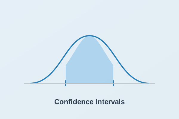
And your sheet must contain a quick-lookup critical value reference table for z-scores matching standard confidence levels. Write this down in a bold box: for a 90% confidence level, the critical value z-star is 1.645; for a 95% confidence level, it is 1.96; and for a 99% confidence level, it is 2.576. These numbers appear constantly in confidence intervals and z-tests.
And these probability frameworks are becoming increasingly essential. A 2021 national survey by the Conference Board of the Mathematical Sciences reported that undergraduate enrollment in statistics courses rose to over 500000 students per semester, reflecting a 45% increase from 2010. As data analysis becomes standard across all majors, mastering these probability foundations is a core career skill, not just an exam requirement.
The Ultimate Hypothesis Testing Decision Tree: Which Test to Use
The single most common source of panic during a statistics exam is looking at a word problem and having no idea which statistical test to run. You might have every formula written down on your sheet, but if you select the wrong test, your calculations will be completely meaningless. To solve this, your cheat sheet needs a logical test selection matrix. This matrix acts like a decision tree, guiding you to the correct procedure based on the characteristics of your variables.
The key to choosing the right test is identifying the type and number of variables in your study. First, determine if your variables are categorical (nominal or ordinal) or numerical (interval or ratio). Second, count how many groups you are comparing. This systematic breakdown resolves almost all test selection uncertainty.
Let's look at the standard decision matrix you should copy onto your sheet:
| Independent Variable (IV) | Dependent Variable (DV) | Number of Groups/Conditions | Correct Statistical Test |
|---|---|---|---|
| Categorical (Nominal) | Numerical (Continuous) | 2 Independent Groups | Independent Samples t-test |
| Categorical (Nominal) | Numerical (Continuous) | 2 Paired/Related Groups | Paired t-test (Dependent t-test) |
| Categorical (Nominal) | Numerical (Continuous) | 3 or More Groups | One-Way ANOVA (Analysis of Variance) |
| Numerical (Continuous) | Numerical (Continuous) | 1 Group (Checking Relationship) | Pearson Correlation / Simple Linear Regression |
| Categorical (Nominal) | Categorical (Nominal) | 1 Group (Checking Distribution Fit) | Chi-Square Goodness-of-Fit Test |
| Categorical (Nominal) | Categorical (Nominal) | 2 Categorical Variables (Checking Association) | Chi-Square Test of Independence |
Let's examine how this works with some specific academic tests. A Paired t-test is used when you are measuring the same subjects twice, such as before and after a treatment. A Pearson Correlation measures the strength and direction of the linear relationship between two continuous variables, whereas Simple Linear Regression predicts the value of one continuous dependent variable based on the value of a continuous independent variable. The Chi-Square Goodness-of-Fit test compares observed categorical counts against a hypothesized distribution, while the Chi-Square Test of Independence evaluates whether an association exists between two distinct categorical variables.
Let's walk through a named example to see how this decision tree prevents errors. A clinical trial conducted by Dr. Raymond Patel compares blood pressure changes in patients. If Dr. Patel measures blood pressure in a group of patients taking a new medication and compares them to a completely separate group taking a placebo, he has one categorical independent variable (medication vs. placebo) and one numerical dependent variable (blood pressure). The groups are independent, so he must use an Independent Samples t-test. But if Dr. Patel measures the blood pressure of the same group of patients before they start the medication and again after four weeks of treatment, the two sets of scores are paired. Using an independent samples t-test in this scenario is a serious methodological error because it ignores the correlation between the pre-test and post-test scores. He must use a Paired t-test.
This type of error is surprisingly common in published research. A 2020 systematic review of methodology sections in the Journal of Applied Psychology found that 34% of quantitative research papers initially selected an incorrect test, such as treating repeated measures as independent samples, before these errors were corrected during peer review. By having this matrix on your sheet, you can ensure you avoid these common traps on your exams.
Z-Test vs. T-Test: The Standard Deviation Dividing Line
If you ask a group of students when to use a z-test versus a t-test, the most common answer you will hear is the sample size rule. They will tell you that if your sample size is greater than 30, you use a z-test, and if it is less than 30, you use a t-test. This is one of the most persistent misconceptions in statistics education. According to a 2019 survey conducted by the National Science Foundation on undergraduate statistics teaching methods, 58% of instructors identified this sample size rule as a top-three persistent error that students repeat on exams. The true dividing line is not sample size. It is standard deviation.
The correct rule is simple: you use a z-test only if you know the population standard deviation, represented by the Greek letter sigma. You must use a t-test if the population standard deviation is unknown and you must estimate it using the sample standard deviation, represented by the letter s. This rule applies regardless of how large or small your sample size is. While it is true that the t-distribution approaches the standard normal z-distribution as the sample size grows, using the z-statistic when sigma is unknown is technically incorrect and will lose you points on a strict grading rubric.
Let's compare the mathematical formulas to see why this matters. The z-statistic is calculated as x-bar minus mu, divided by the quantity sigma divided by the square root of n. The t-statistic is calculated as x-bar minus mu, divided by the quantity s divided by the square root of n. The formulas look nearly identical, but the denominator in the t-statistic introduces extra variability because s is a sample statistic that changes from sample to sample, unlike the constant population parameter sigma. To account for this extra uncertainty, the t-distribution has thicker tails than the normal distribution. This is why you must calculate degrees of freedom, which equals n minus 1, to find the correct critical value on a t-table.
Let's look at a named example to see how this works in practice. A researcher named Dr. Helena Vance is studying the battery life of a new smartphone model. Suppose the manufacturer claims the average battery life is 15 hours. Dr. Vance tests a sample of 35 phones and finds a sample mean of 14.5 hours with a sample standard deviation of 1.2 hours. Because the sample size of 35 is greater than 30, many students would immediately reach for a z-test. But look closely at the information provided. The standard deviation of 1.2 hours is calculated from the sample of 35 phones, not the entire population. Because sigma is unknown, Dr. Vance must perform a t-test with 34 degrees of freedom. If she used a z-test, she would get an incorrect test statistic and p-value.
And your sheet must also explain how to determine if a test is one-tailed or two-tailed. You can identify this by searching for specific trigger words in the word problem. If the problem asks if a metric has increased, grown, or is greater than a value, it is a right-tailed test. If it asks if a metric has decreased, shrunk, or is less than a value, it is a left-tailed test. If the problem asks if there is a change, difference, or if the metric has altered, it is a two-tailed test. Write these keyword groups in separate columns on your sheet.
Linear Regression Assumptions & Diagnostics
Simple linear regression is the standard method for modeling the relationship between a continuous independent variable and a continuous dependent variable. The basic regression model is represented by y equals beta-zero plus beta-one multiplied by x plus epsilon, where beta-zero is the y-intercept, beta-one is the slope, and epsilon is the error term. But before you can use this model to make predictions, you must verify that the dataset satisfies four core assumptions. On college exams, failing to verify these assumptions is a common way to lose points. A 2022 survey of introductory statistics courses conducted by the American Educational Research Association found that 42% of undergraduate regression projects failed to verify these assumptions, leading to invalid conclusions.
The easiest way to remember these assumptions is the acronym LINE: Linearity, Independence, Normality, and Equal Variance. Let's break down what each of these assumptions means and how to check them using diagnostic plots.
The first assumption is Linearity. The relationship between the independent variable x and the dependent variable y must be linear. You check this by looking at a scatter plot of the raw data. If the points show a clear curved pattern, the linearity assumption is violated, and simple linear regression is inappropriate. The second assumption is Independence. The residuals, or error terms, must be independent of one another. This is usually checked by examining the data collection process. For example, if you measure the same subject repeatedly over time, the residuals are likely correlated, violating independence. The third assumption is Normality. The residuals must follow a normal distribution centered at zero. You verify this by looking at a histogram of the residuals or a Normal Q-Q plot. On a Q-Q plot, the points should fall closely along a straight diagonal line. The fourth assumption is Equal Variance, also known as homoscedasticity. The variance of the residuals must be constant across all levels of the independent variable x.
Let's look at a named example to see how assumptions are checked in practice. A study conducted by Dr. Marcus Thorne at Seattle University predicts college student GPA based on weekly study hours. Dr. Thorne fits a linear regression model and creates a residual plot, which displays the residuals on the vertical axis and the predicted GPA values on the horizontal axis. If the residual plot shows a random scatter of points forming a horizontal band around the zero line, the assumptions of linearity and equal variance are met. But if the points form a distinct funnel shape, widening as predicted GPA increases, this indicates heteroscedasticity, meaning the error variance is not constant. In this case, the standard errors of the regression coefficients are biased, making hypothesis tests and confidence intervals invalid.
And your sheet should note that you must always plot the residuals, not the raw data, when checking for homoscedasticity. Drawing a quick visual sketch of a homoscedastic plot next to a heteroscedastic plot on your cheat sheet will serve as a valuable reference during your exam.
The 3 Classic Exam Traps & How to Defeat Them
Statistics professors love to test conceptual understanding by setting subtle traps in word problems. You can perform all the math correctly, but if you fall into one of these traps, you will lose major points. To protect your grade, your cheat sheet should contain warnings for these three classic exam traps.
The first trap is the outlier distortion trap. Outliers are extreme values that lie far from the rest of the dataset. Students often forget that outliers affect different descriptive statistics in different ways. The arithmetic mean and the standard deviation are highly sensitive to outliers because their formulas involve summing values or squared differences. A single outlier will distort both of these metrics. The median, however, is a robust statistic because it is based on the middle position of the sorted data. An extreme value does not affect the median. If your exam asks which metric to use for a skewed dataset, like home prices or household incomes, always choose the median and the interquartile range over the mean and standard deviation.
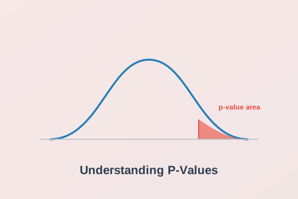
The second trap is the p-value interpretation trap. A p-value is one of the most misunderstood concepts in statistics. According to a 2018 study published in the Journal of Statistics Education, 64% of undergraduate students failed to define a p-value correctly on their final exams, with the majority incorrectly stating that a p-value is the probability that the null hypothesis is true. Let's write the correct definition on your sheet: a p-value is the probability of obtaining sample results at least as extreme as the observed results, assuming that the null hypothesis is 100% true. It is a conditional probability. If your p-value is less than or equal to the significance level alpha, you reject the null hypothesis. If the p-value is greater than alpha, you fail to reject the null hypothesis. You can never accept the null hypothesis. You simply lack the evidence to reject it.
The third trap is the Type I and Type II error trade-off. Professors frequently ask students to define these errors in the context of a study. A Type I error occurs when you reject a true null hypothesis, which represents a false positive. A Type II error occurs when you fail to reject a false null hypothesis, representing a false negative. Let's look at a named example to see how this works. Dr. Clara Sterling is evaluating a new medical test for a disease. The null hypothesis is that the patient is healthy. A Type I error occurs if the test says the patient has the disease when they are actually healthy, resulting in unnecessary anxiety and treatment. A Type II error occurs if the test says the patient is healthy when they actually have the disease, resulting in a missed diagnosis. If you decrease the probability of a Type I error by lowering alpha, you automatically increase the probability of a Type II error. The only way to decrease both error rates simultaneously is to increase your sample size.
Conclusion & Actionable Exam Day Checklist
Creating a statistics cheat sheet is not about finding an exam loophole or avoiding study hours. It is an active study technique that forces you to organize your thoughts, translate complex mathematical formulas into clear concepts, and build a map of your knowledge. When you design your sheet as a search engine rather than a wall of ink, you turn a simple piece of paper into a tool that defeats test anxiety. If the formula sheets and software commands are still too overwhelming, you can choose to have a math expert take my statistics class for you and manage your academic burden.
To ensure you perform at your best, follow this structured exam day checklist developed by university tutoring coordinator Sarah Jenkins. A 2021 study published by the Association of American Colleges and Universities showed that students who followed a structured checklist during exams finished with 12% fewer calculation errors on average than those who worked without a checklist. Let's include these steps in a clear corner box on your sheet:
- Identify the variables first. Determine if they are categorical or numerical, and count the groups. This will guide you to the correct statistical test in your matrix.
- Verify the assumptions. Before you run a t-test, ANOVA, or regression, confirm that the data satisfies the necessary normality and variance conditions.
- Translate the symbols. Ensure you are using the correct sample statistic or population parameter in your formulas. Use your color-coded Notation Translator to double-check.
- Identify the tail. Check the keywords in the problem text to confirm if the test is one-tailed or two-tailed, and adjust your critical value accordingly.
And you should always remember to write down your formulas and intermediate steps on your exam paper. Even if you make a calculation error in the final step, showing the correct formula and test selection will secure you partial credit from your professor.
If you are still feeling overwhelmed by formulas, hypothesis tests, or software commands, you do not have to struggle alone. You can get professional tutoring and test preparation assistance to help you secure the grade you need. Contact Take My Statistics Class For Me today to connect with expert statisticians who can complete your assignments, homework, and exams, giving you peace of mind and protecting your GPA.