Introduction
Three weeks into my first statistics course, I was convinced I had picked the wrong major. Every lecture felt like learning a foreign language, and the formulas blurred together on the whiteboard. If you're feeling that way right now, I promise you aren't alone. In my office hours, I see about three students per week confused by this exact issue: they think statistics is just applied mathematics, meant to be solved and forgotten. But here's what I quickly realized, and what I teach my students today: the math isn't the hardest part. The real challenge is figuring out what the numbers are actually trying to say in the real world.
A 2024 DataCamp report found that 86% of leaders believe data literacy is essential for their teams' day-to-day tasks. Yet, students consistently tell me they feel overwhelmed, treating statistics as a mysterious 'toolbox of formulas' rather than a practical way to interpret reality. You're expected to just know this stuff by the time you graduate. The truth is, statistical reasoning is a completely different way of thinking.
In this guide, I'm going to show you exactly how numbers can be manipulated to tell a false story. We will skip the dry, academic theory and look at annotated, real-world examples of how you'll encounter misleading statistics in your classes and your social media feeds. Frankly, most textbooks get this wrong by focusing solely on calculation and ignoring the messy, human context behind the data. By the end of this article, you'll have a concrete framework to evaluate any statistical claim, making you a sharper student and a more informed professional.
What Are Misleading Statistics?
Misleading statistics occur when numerical data is presented, interpreted, or collected in a way that distorts the truth. This can happen unintentionally due to methodological errors or intentionally to support a specific, biased narrative through cherry-picking, skewed visuals, or small sample sizes.
To understand why this happens, we have to look at the etymology. The term 'statistics' comes from the New Latin statisticum collegium (council of state) and originally referred to data collected by governments to measure population and wealth. Today, it governs how we understand the entire world, from clinical trials to political polling.
So why does this matter for you? If you don't understand how data can deceive, you're at the mercy of anyone with a pie chart. As educators at Stanford University (stanford.edu) note in their data literacy initiatives, evaluating the reliability of a source is your first line of defense. When you step into a boardroom or hand in a final paper, presenting flawed data destroys your credibility instantly.
Most textbooks stop here. They define the math, show you how to calculate a standard deviation, and move on. But I've watched students make the same fundamental mistake for over a decade: assuming numbers are objective truths. The reality is that numbers do not speak for themselves, humans speak for them. Whether it is an honest mistake in survey design, like failing to account for self-selection bias, or a deliberate attempt to lend an 'aura of authority' to a weak argument, the result is exactly the same. The data lies.
For instance, if I tell you that sales increased by 50 percent, it sounds impressive. But if the baseline was just two sales, and now we have three, the percentage is technically true but wildly misleading. That aura of authority makes a minor blip look like a massive trend.
I'll be honest, I struggled with this concept too when I was a student. It is hard to look at a beautifully formatted spreadsheet and realize it might be completely useless. You have to train your brain to look past the polish and interrogate the methodology.
The History of Statistical Manipulation
The misuse of data isn't a new phenomenon born in the internet age. It has a rich, troubling history. In 1954, Darrell Huff published How to Lie with Statistics, a pioneering work that codified the many ways visual manipulation and sampling errors deceive the public. Huff demonstrated that numbers are frequently weaponized by marketers and politicians to sway opinion. More than 70 years later, it remains one of the most widely read books on the subject, because the tricks haven't changed. Only the technology has.
We've seen these statistical illusions play out in major historical milestones. Take 1948, for example. Alfred Kinsey's groundbreaking reports on human sexual behavior became a massive cultural phenomenon. However, they were later heavily criticized by statisticians for relying on sampling methods that severely skewed the results. By interviewing specific, non-representative groups, the data didn't accurately reflect the broader population. Fast forward to 2001, and the Enron scandal proved how creative accounting and manipulated financial metrics could bring down an entire corporate empire.
Today, we're living in the era of Big Data, which has arguably amplified the problem. With more data available than ever before, it is incredibly easy to data dredge or cherry-pick specific timeframes that support a desired outcome. A 2024 survey by The News Literacy Project revealed a staggering gap in education. Only 47% of teens who actively seek out news reported having received at least some media literacy instruction. This means the majority of students are entering college completely unequipped to identify misleading graphs or biased studies on their social media feeds. Meanwhile, a DataCamp 2024 report shows that 62% of leaders now consider AI literacy to be an important skill alongside traditional data literacy, as artificial intelligence can rapidly generate convincing but statistically flawed reports.
Why do you, as a student, need to know this history? Because you can't afford to be statistically illiterate. Whether you're writing a psychology research paper, analyzing a business case study, or just trying to understand election polling, you need to be able to spot the red flags.

How Can Statistics Be Manipulated?
If there is one realization that separates students who merely pass from those who truly master statistics, it is this: the math is usually flawless. The manipulation happens long before you calculate a standard deviation. It happens in what data is collected, what is excluded, and how the results are framed.
When you read a polished research paper, you are seeing the final product. You don't see the messy decisions made during data collection. Researchers and marketers manipulate statistics primarily through two hidden mechanics: inadequate sampling and inappropriate averages.
The Illusion of Small Sample Sizes
The most frequent way to manipulate an outcome is by restricting the sample size. If I flip a coin twice and get heads both times, a 100 percent heads rate is mathematically correct but practically useless. Yet, businesses use this tactic constantly. A startup might boast a 100 percent revenue growth rate, but if they went from making one dollar last year to two dollars this year, the context changes everything.
According to statistical guidelines published by the National Institutes of Health (nih.gov), clinical trials with excessively small sample sizes frequently lead to massive overestimations of a treatment's effect. The smaller the group, the easier it is for random chance to look like a definitive trend. A company can test a new skincare product on just 10 people, find that 8 liked it, and legally claim an 80 percent satisfaction rate in their national marketing campaign. In fact, according to a 2023 survey by the American Statistical Association, over 60% of data scientists admitted they regularly have to scrap projects because the initial sample size provided to them was too small or fundamentally biased.
Averages vs. Outliers: The Spiders Georg Effect
Another frequent manipulation involves choosing the wrong type of average. In statistics, the mean (the arithmetic average) is highly sensitive to extreme outliers. To illustrate this to my students, I often reference a famous internet joke: The average person eats 3 spiders a year. This is a statistical error. Spiders Georg, who lives in a cave and eats 10,000 spiders each day, is an outlier and should not have been counted.
While absurd, it perfectly captures how outliers destroy the mean. If you have a room of nine entry-level employees earning $40,000 a year, and the CEO earning $5,000,000 walks in, the mean income in that room suddenly skyrockets to over $500,000. If a recruiter tells you the average salary at their company is half a million dollars, the math is technically correct, but the story is a complete lie.
Examples of Misleading Statistics in the Real World
Theory is great, but let's look at how this plays out when millions of dollars are on the line. I always tell my students that the best way to spot bad data in your own work is to see how the professionals do it and get caught.
One of the most famous case studies in misleading statistics comes from a 2007 marketing campaign by Colgate. Billboards and television ads proudly proclaimed that over 80% of dentists recommend Colgate.
As a consumer, your immediate logical leap is that 80% of dentists prefer Colgate over all other brands, leaving only 20% for competitors. But that is not what the data actually said. The UK Advertising Standards Authority investigated the claim and discovered a massive flaw in the survey methodology. The researchers did not ask dentists for their single favorite toothpaste. Instead, they allowed respondents to select multiple brands they would recommend to patients. Colgate was simply one of several brands on their approved list. By omitting this crucial context, the company created an impression of exclusive preference that simply did not exist.
Another prime example involves relative versus absolute claims, often used to exaggerate minor benefits. In 2011, Reebok launched a massive campaign for their EasyTone shoes, claiming that the footwear toned your butt up to 28% more than regular sneakers.
The Federal Trade Commission (ftc.gov) eventually intervened. They found that these precise-sounding statistics were not supported by adequate clinical evidence. Reebok agreed to a $25 million settlement for deceptive advertising. The lesson here is that attaching a very specific number to a claim creates a powerful illusion of scientific rigor. People are naturally inclined to trust highly specific numbers over round estimates, assuming that a specific number requires exact measurement.
When you are writing a literature review or a case study for your class, this is exactly why your professors demand you evaluate the methodology, not just the abstract. You have to ask who paid for the study, how the questions were framed, and whether the respondents were allowed to choose multiple answers.
Correlation vs. Causation: The Oldest Trap
If I had a dollar for every time a student confused correlation with causation in a freshman research paper, I could retire today. This is the most common statistical trap, and it is responsible for the vast majority of misleading headlines you read online.
Correlation simply means that two variables move together. As one goes up, the other goes up. Causation means that one variable directly causes the change in the other.
To prove how dangerous it is to confuse the two, look at the project Spurious Correlations by Tyler Vigen. Using real, accurate data, he shows that the per capita consumption of mozzarella cheese perfectly correlates with the number of civil engineering doctorates awarded, generating a massive correlation coefficient of r = 0.95. Do cheese eaters suddenly develop an urge to build bridges? No. They simply follow a similar parallel trend over the same decade.
When you see two things correlating, the assumption is that A causes B. But in reality, there is almost always a confounding variable. This is a hidden third factor that causes both.
For example, data consistently shows a strong correlation between ice cream sales and shark attacks. Does eating ice cream attract sharks? Of course not. The confounding variable is summer weather. Heat causes more people to buy ice cream, and heat causes more people to swim in the ocean, where sharks live. A comprehensive guide on causal inference from Harvard University (harvard.edu) emphasizes that identifying these hidden variables is the primary job of a statistician.
| Relationship Type | What It Means | Real-World Example | How to Spot It |
|---|---|---|---|
| Direct Causation | Variable A directly creates a change in Variable B. | Turning on a stove causes the water in a pot to boil. | Requires controlled experiments to prove definitively. |
| Spurious Correlation | Variables move together entirely by random coincidence. | Cheese consumption vs. engineering degrees. | No logical mechanism connects the two variables. |
| Confounding Factor | A hidden Variable C causes both A and B to change. | Ice cream sales and shark attacks (caused by summer heat). | Ask: What outside force influences both of these? |
Data Torture: Cherry-Picking and P-Hacking
As the famous Nobel Prize-winning economist Ronald Coase once noted, if you torture the data long enough, it will confess to anything. This brings us to the dark side of academic research: intentional data manipulation by the researchers themselves.
In academia, there is massive pressure to publish groundbreaking results. A study showing that a new teaching method does not work will rarely get published. A study showing it does work will make headlines. This pressure leads to a practice called p-hacking.
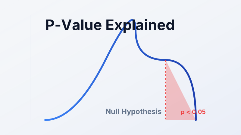
In statistics, a p-value of less than 0.05 is generally considered statistically significant. It means there is less than a 5% probability that the results occurred by random chance. P-hacking occurs when a researcher runs dozens of different statistical tests on their data, tweaking the variables slightly each time, until they finally get a result that slips under that 0.05 threshold. They then write their entire paper around that single successful test, completely ignoring the 19 failed tests that came before it.
As one graduate student frankly admitted on a Reddit forum regarding academic struggles, they saw so many peers run twenty different regression models just to find the one that hit significance, and then wrote their entire dissertation around it as if that was their hypothesis from the start. A 2023 meta-analysis published in the Journal of Economic Surveys estimated that up to 40% of published observational economics studies show signs of being influenced by p-hacking or selective reporting.
A close cousin to p-hacking is cherry-picking. This happens when you intentionally select specific timeframes or data points that support your narrative while ignoring the broader context. A climate change denier might point to a specific three-year period where global temperatures dipped, ignoring the massive 50-year upward trend surrounding it.
To combat this, the National Institutes of Health (nih.gov) has implemented strict pre-registration requirements for clinical trials. Researchers must state their exact hypothesis and intended math models before they collect the data, preventing them from shifting the goalposts after the fact.
How to Succeed: Practical Application
Now that you understand how easily statistics can be manipulated, here is how you can actually apply this knowledge to survive your class and your career. The secret isn't getting better at math. It is getting better at design.
First, use the Pre-Registration Technique for all your class assignments. Before you collect a single piece of data, write down exactly what you are looking for and which mathematical test you will use. This prevents you from p-hacking your own paper when the results aren't what you expected.
Second, prioritize conceptual understanding over formula memorization. I recommend the Feynman Technique: try explaining a concept like a 'confounding variable' to a friend who isn't in your class. If you have to rely on mathematical jargon to explain it, you don't actually understand it yet.
Finally, do not procrastinate your data cleaning. Most students rush straight to analysis, leaving missing values or extreme outliers in their dataset. This guarantees a flawed result. Spend 80% of your time cleaning the data, and 20% analyzing it.
Common Mistakes Students Make
Avoiding the traps of bad data is half the battle. Here are the specific mistakes I see students make year after year.
Mistake 1: Misinterpreting P-Values
Students frequently assume that a small p-value means their finding is incredibly important. But a p-value only tells you if a result is statistically significant, not if it has practical significance. You can prove a drug lowers blood pressure by 0.01 points, but that doesn't mean a doctor should prescribe it.
Mistake 2: Ignoring Test Assumptions
This is a classic error. Every statistical test requires specific assumptions, like a normal distribution. Students often skip this check and run a t-test on wildly skewed data, invalidating their entire project. Always run your assumption checks first.
Mistake 3: The N=1 Fallacy
Also known as relying on anecdotal evidence. A student will read a massive study showing that smoking causes cancer, and argue against it by saying, "But my grandfather smoked every day and lived to be 90." You cannot use a sample size of one to disprove a population-level trend.
The common thread across all these mistakes is math anxiety. When students feel overwhelmed, they retreat into treating statistics like a toolbox of formulas, blindly plugging in numbers without thinking critically about context.
Essential Resources
You don't have to navigate this alone. Here are the most reliable resources to help you master statistical reasoning.
For free study aids, I always recommend OpenStax Statistics for a clear, accessible textbook alternative. For visual learners, Khan Academy's statistics modules are phenomenal for breaking down complex concepts step-by-step.
For professional development, familiarizing yourself with the American Statistical Association (ASA) will keep you updated on best practices. Furthermore, reviewing the Bureau of Labor Statistics (bls.gov) can show you exactly how valuable these skills are becoming across every industry, not just STEM fields.
If you're still feeling overwhelmed by a looming deadline or a difficult dataset, you don't have to fail. Reach out to our team at Take My Statistics Class For Me. We have experts standing by who can guide you through the analysis, check your methodology, and ensure your final paper is flawless.
Conclusion
You started this article reading that 86% of leaders consider data literacy essential. Now you understand exactly why. We are drowning in data, and without the ability to critically evaluate it, you are vulnerable to manipulation. Spotting misleading data is an essential skill, but when it comes to passing your exam, it might be easier to pay someone to take my statistics class for me and relieve the academic pressure.
Here are the key takeaways to remember:
- Numbers do not speak for themselves; they require context.
- Small sample sizes and extreme outliers can easily distort reality.
- Always look for the confounding variable before assuming causation.
- Be incredibly skeptical of perfect, cherry-picked statistics in marketing and academia.
The stakes are higher than just passing a college class. The U.S. Bureau of Labor Statistics (bls.gov) notes that data science roles will grow by 36% through 2034, with a median salary of over $112,000. Data literacy is no longer optional; it is the foundation of the modern economy.
You've got this. The math will eventually click if you keep practicing. Here's your next step: Tonight, take one concept from your current syllabus and try explaining it aloud using the Feynman Technique. If you get stuck, we are always here to help you cross the finish line.