
Introduction
Three weeks into my first statistics course, I was convinced I was going to fail. Every lecture felt like learning a foreign language, and the textbook examples seemed completely disconnected from reality. If you are reading this, you are probably in the same boat. You are staring at conflicting studies, wondering how two different papers can use the exact same data to prove opposite points. Before diving into the ways figures can deceive, remember that if you're struggling to keep up with your weekly homework, you can hire someone to take my statistics course and let a professional handle it.
You aren't crazy. In fact, a 2024 report by the World Economic Forum identified the spread of misinformation—often fueled by cherry-picked data and misleading statistics—as a top global risk. In my office hours, I constantly see students struggle with this exact issue. They assume that if a number is published in a journal or cited on the news, it must be the absolute truth.
But numbers are easily manipulated. Many people intentionally mislead others or themselves due to ignorance, inexperience, or failing to account for study limitations. By the end of this guide, you will have a foolproof framework for spotting fake data and manipulative charts. I'm going to show you exactly how numbers are twisted to fit an agenda, and more importantly, how to protect your own research papers from falling into these traps.
Unlike most textbooks that focus purely on the math, we are going to look at the human element of data manipulation. Because the truth is, the math is rarely the problem.
Do Numbers Lie? Data vs. Interpretation
"Misleading statistics" refers to the misuse or misinterpretation of numerical data, whether intentional or unintentional, to create a false or skewed impression of reality.
The phrase "statistics can lie" is a bit of a misnomer. The raw data—the actual counts of events, survey responses, or measurements—are objective facts. The "lie" occurs during the translation process. It happens when a human being decides which data points to highlight, how to visualize them on a graph, and what conclusions to draw for the audience.
Why Do People Misuse Statistics?
When you are writing a term paper or analyzing a case study, your credibility relies entirely on the quality of your evidence. If you cite a misleading statistic, your entire argument collapses. In the real world, bad statistics lead to bad policies, flawed business decisions, and a general erosion of public trust.
Most textbooks stop at teaching you how to calculate a standard deviation, but they completely miss the most important part: the human agenda. I'll be honest—I struggled with this concept too when I was a student. I thought equations were immune to bias.
However, academic experts at institutions like Columbia University emphasize that statistics are just tools. Dr. Andrew Gelman, a Professor of Statistics at Columbia, summarizes this perfectly: "Statistics are tools, and like any tool, they can be used effectively or deceptively." The deception is rarely a fabricated number. Instead, it is a sin of omission. It is the researcher choosing to leave out the control group, or the journalist deciding to publish a percentage increase without mentioning the original baseline.
How to Think About Data
You need to approach every statistic as an argument, not a fact. Someone is using that number to convince you of something. Your job is to figure out if their math actually supports their claim.
A Brief History of Statistical Deception
The concept of lying with numbers isn't new, but our awareness of it skyrocketed in the mid-20th century. In 1954, a freelance journalist named Darrell Huff published a book titled How to Lie with Statistics. Featuring illustrations by Irving Geis, the book aimed to warn the general public about the tricks advertisers and politicians used to distort data.
The Evolution of Data Literacy
During the 1960s and 1970s, Huff's book became a staple in college classrooms. It cemented the idea that statistical literacy is a crucial life skill, not just a requirement for math majors. Educators began teaching students to look out for "semi-attached figures" and visually manipulative charts.
However, the game has changed entirely since 1954. Today, we aren't just dealing with a tricky billboard ad for toothpaste. We are dealing with massive datasets, p-hacking in academic journals, and social media algorithms optimized for engagement rather than truth.
Where We Are Now
The volume of data we consume daily is staggering, and our ability to parse it is failing. A 2024 survey by the Pew Research Center found that a large portion of the public feels it is increasingly difficult to distinguish between true and false information online. Algorithms actually reward misleading statistics because extreme claims generate more clicks, comments, and shares than nuanced, accurate reporting.
Why Students Need to Know This
Frankly, most textbooks get this wrong by focusing too much on the formulas. You don't just need to know how to run a t-test; you need to know how to defend yourself against bad data. Whether you are writing a literature review for your capstone project or trying to decide which political candidate's economic claims are accurate, you have to be your own fact-checker. If you can't spot a misleading statistic, you are letting someone else do your thinking for you.
3 Real-World Examples of Misleading Data
You might think statistical manipulation only happens in dense academic journals or political debates. But here is the reality: you interact with misleading data every single day. In my ten years analyzing corporate reports and grading student case studies, I've seen how easily brands and media outlets twist data to support a pre-determined narrative.
Let's look at three specific examples of how numbers are weaponized in the real world.
1. The Colgate 80% Dentist Survey (Survey Design Flaw)
For years, Colgate ran an advertising campaign boasting that "80% of dentists recommend Colgate." If you read that statistic, the immediate conclusion is obvious: Colgate must be vastly superior to every other toothpaste on the market, leaving only 20% of dentists to split among the competitors. It sounds like an overwhelming endorsement.
But the data collection method was deeply flawed. The survey allowed dentists to select multiple brands of toothpaste that they would recommend to patients. They did recommend Colgate, but many of them also recommended Crest and Sensodyne at the exact same time. The Advertising Standards Authority eventually banned the ad, ruling it deceptive. According to the American Statistical Association (ASA) 2023 guidelines on practice, survey framing is one of the most common ways data is distorted before it even becomes a statistic. They ask a question designed to generate a specific answer.
2. The 2023 Burger King "Whopper" Lawsuit (Visual Misrepresentation)
A recent, highly publicized class-action lawsuit targeted Burger King, with plaintiffs arguing that the company's advertisements depicted the "Whopper" burger as significantly larger and meatier than the product actually served to customers in-store.
Why does a burger lawsuit matter for a statistics guide? Because this is the exact same psychological trick as a truncated y-axis in data visualization. By manipulating the visual scale (making the burger look 35% larger on screen), you exaggerate the value of the product. The same thing happens in corporate boardrooms. A 2023 study published in The CPA Journal analyzed 50 public companies and found that 86% of their annual reports contained at least one broken or misleading chart. They routinely start the y-axis at a number other than zero to make a 2% profit increase look like a monumental 500% surge. The raw number is technically true, but the visual representation is a complete lie.
3. Social Media Algorithms (Selection Bias)
Social media platforms frequently report massive "user engagement" statistics, suggesting that certain viral topics represent the consensus of the population. But MIT researchers have continuously shown that social media algorithms are engineered to prioritize polarizing, emotional content.
When you look at a trending topic on X (formerly Twitter) or TikTok, you are not seeing a random sample of public opinion. You are seeing a highly curated feed of the most extreme viewpoints. This is a massive case of selection bias. The statistics generated by these platforms are technically accurate regarding platform engagement, but they are entirely misleading if you try to use them as a proxy for public sentiment.
Common Traps: Correlation vs. Causation, P-Hacking, and Bias
If business metrics are manipulated for profit, academic statistics are manipulated for survival. In my experience reading thousands of student papers and published studies, the phrase "publish or perish" explains 90% of bad science. Researchers are under immense pressure to produce groundbreaking, "statistically significant" results. Nobody gets tenure for publishing a study that proves absolutely nothing changed.
This pressure leads to three common statistical traps that you need to be able to identify in your own research.
Trap 1: Correlation vs. Causation
This is the oldest logical fallacy in the book, yet I see graduate students fall for it every single semester. Just because two variables move together (correlation) does not mean one caused the other (causation).
The classic example is ice cream sales and shark attacks. Both spike in July and crash in December. They are highly correlated. Does eating ice cream attract sharks? Of course not. The "confounding variable" is the summer heat, which causes people to buy ice cream and go swimming in the ocean. When reading a study, always ask yourself if there is a hidden third variable driving the results.
Trap 2: P-Hacking (The Garden of Forking Paths)
This is the dirty little secret of the academic world. Over 50% of published research in some scientific fields may suffer from p-hacking or publication bias, according to researchers at the Stanford Meta-Research Innovation Center (METRICS).
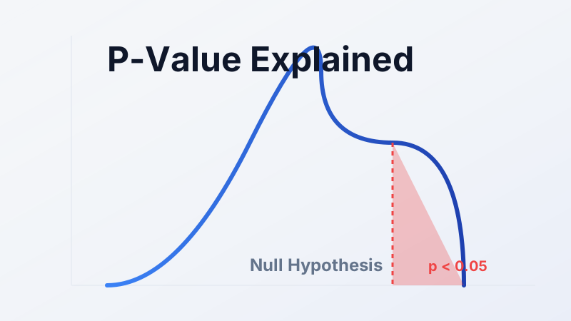
P-hacking (also called data dredging) happens when a researcher continuously analyzes their data in different ways until they find a result that hits the magic "p < 0.05" threshold for statistical significance. They might drop a few "outliers," control for different variables, or switch their primary outcome measure halfway through the study. Educational resources from the Berkeley Initiative for Transparency in the Social Sciences (BITSS) show how this practice drastically inflates false-positive rates. They aren't faking the data, but they are torturing it until it confesses to what they want to hear.
Trap 3: Sample Bias
A study is only as strong as its sample. If you survey 100 college students about their sleep habits, you cannot title your paper "The Sleep Habits of the American Public." Your sample is heavily skewed toward young adults who stay up late studying.
I frequently see students cite medical studies with sample sizes of 12 people. With a sample that small, random chance plays a massive role. One extreme outlier can skew the entire average. Always check the methodology section to see who was studied and how many people were included.
Comparison of Statistical Traps
To help you memorize these concepts for your next exam or paper, here is a breakdown of how they differ in practice.
| Statistical Trap | Core Issue | Best Spotted By | Example Application |
|---|---|---|---|
| Correlation vs. Causation | Assuming a relationship is driven by direct cause and effect. | Looking for unmeasured confounding variables (the "hidden third factor"). | Assuming diet soda causes weight gain, ignoring that dieters prefer diet soda. |
| P-Hacking | Manipulating the analysis until the data looks statistically significant. | Reviewing if the researcher changed their hypothesis after seeing the data. | Testing 50 different foods until one randomly shows a link to cancer. |
| Sample Bias | The people or items tested do not represent the broader population. | Reading the "Methodology" section to find the exact demographics and sample size (N). | Conducting a political poll exclusively on a hyper-partisan news website. |
How to Evaluate Statistical Claims
Now that you understand how data is manipulated, here is how to actually apply this knowledge in your classes. You don't need a PhD in mathematics to spot a bad statistic. You just need a healthy dose of skepticism.
The D.I.G. Framework
In 2023, The Data Literacy Project popularized a simplified approach for students called the D.I.G. Framework (Data Source, Interpretation, Graphics validity). It pairs perfectly with the University of Washington's "Calling Bullshit" curriculum, which teaches students how to navigate the modern misinformation landscape.
Study Strategy: The Modified Cornell Method
If you are writing a literature review, I highly recommend adapting the Cornell Note-Taking Method specifically for data analysis. Divide your page into two columns. In the left column, write the author's primary claim. In the right column, write down the exact raw numbers and the sample size (N) they used to prove it. This forces you to separate the rhetoric from the reality.
The 3 Magic Questions
Whenever you encounter a statistic in an exam or a news article, ask these three questions before believing it:
- Compared to what? A number without context is meaningless. If a company claims a 50% drop in complaints, you need to know if they started with 2 complaints or 2,000.
- Since when? Did they start their chart at the exact bottom of a recession to make the recovery look miraculous? Always check the timeline.
- Says who? Follow the funding. If a study concludes that sugary cereal is a healthy breakfast, check if a cereal conglomerate funded the research.
Common Mistakes Students Make in Statistics
I have graded thousands of statistics papers, and I see the exact same errors repeatedly. These mistakes happen because students rush to the analysis phase without truly understanding the data they are holding. Here is what you need to avoid.
Mistake 1: Confusing Statistical vs. Practical Significance
This is easily the most common error in student research, heavily discussed on r/college and r/AskProfessors. You run a test, your p-value is 0.04, and you enthusiastically declare a breakthrough. But statistical significance just means the result probably isn't a fluke. It does not mean the result is practically significant in the real world. A new drug might reduce a headache 1% faster than aspirin (p < 0.05), but practically, no patient cares about a 1% difference.
Mistake 2: The N=1 Fallacy (Anecdotal Evidence)
I constantly see students try to refute a massive statistical trend with a single personal anecdote. "The CDC says smoking decreases lifespan, but my grandfather smoked a pack a day and lived to 90." One outlier does not invalidate a trend. In statistics, we care about the aggregate, not the anecdote.
Mistake 3: Using the Wrong Statistical Test
Students frequently run a standard t-test on data that is wildly skewed or not normally distributed. You cannot just plug numbers into statistical software and pray. If your data doesn't meet the underlying assumptions of the test, your output is completely meaningless garbage.
Essential Resources for Mastering Statistics
You don't have to navigate this alone. If your professor's lectures aren't clicking, tap into these verified resources.
Free Learning Resources
For building foundational knowledge, ditch the dense textbooks. Khan Academy offers an incredible, free AP Statistics course that breaks down probability and significance testing into plain English. If you need a written textbook, OpenStax Introductory Statistics is peer-reviewed and completely free.
Professional Research Tools
When you are looking for examples of statistical bias for a paper, I highly recommend checking out The Catalogue of Bias, maintained by experts at the University of Oxford's Centre for Evidence-Based Medicine. It provides real-world examples of publication bias, selection bias, and confounding variables. For official data sets, always default to .gov sources like the U.S. Bureau of Labor Statistics (BLS) to ensure you are starting with untampered numbers.
Our Expert Services
If you are completely overwhelmed by a looming deadline or a dataset that won't cooperate, we can help. Our statistics experts can run your analyses, tutor you through complex concepts, or provide the exact guidance you need to pass.
Conclusion
We started this guide looking at the World Economic Forum's warning about the dangers of misinformation. The truth is, statistical literacy is your absolute best defense against it.
Numbers don't lie, but the people wielding them certainly do. Whether it is a corporation truncating a y-axis to hide a loss, or a researcher p-hacking their way to tenure, data is constantly manipulated to serve an agenda. Your job isn't to distrust all data; your job is to ask, "Compared to what? Since when? And says who?"
I'll be honest—learning this takes time. But the payoff is massive. The Bureau of Labor Statistics projects a staggering 34% job growth for data scientists by 2034. Master how to interpret and defend data, and you master your career trajectory.
Here is your next step: Tonight, look at one news article claiming a "massive increase" in something. Find the original study linked in the article, and check the baseline number. I guarantee you'll be surprised.